 |
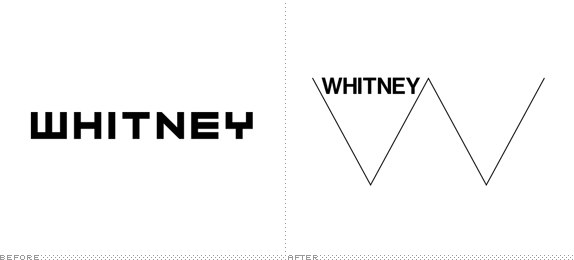
| Before and After |
Comissioned by Experimental Jetset the Whitney Museum of American art released their new branding identity. Initially my thoughts were that it looked too simple as a stand alone image, I felt like the weight of the lines were too thin and created too much space and the helvetica seemed too bold and generic as a font choice, however by doing more research its clear that the simplicity of the shape has been fully utilised to fit many different aspects of the museums identity and be incredibly adaptable with the merchandise and advertising. In comparison to its past identity I think this new design fits the energy of the museum and the city of New York. Comparing it to other museum identity i find this one quite refreshing.


No comments:
Post a Comment