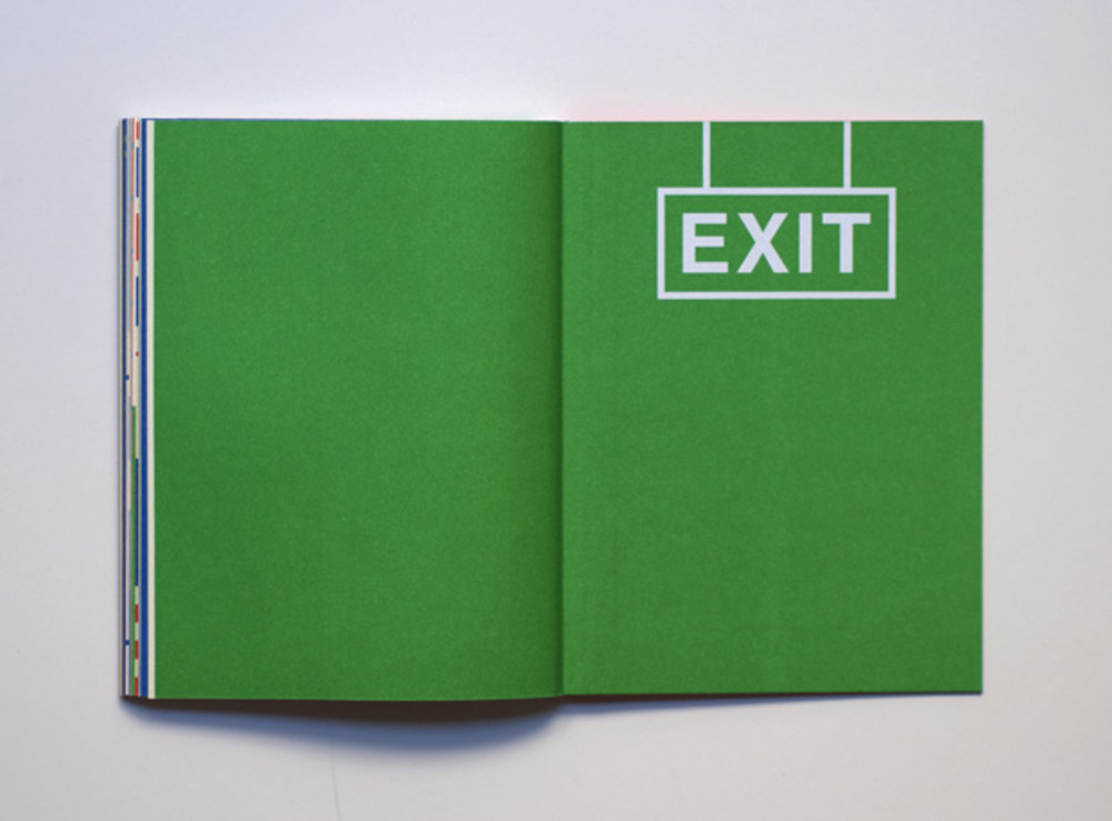
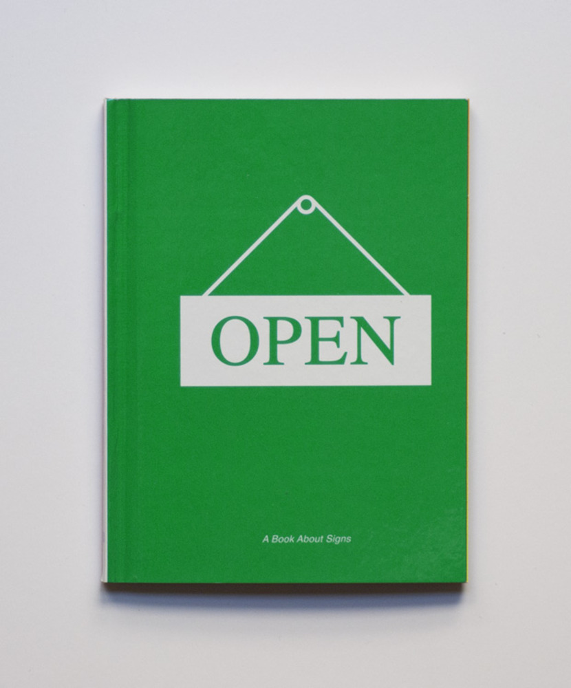
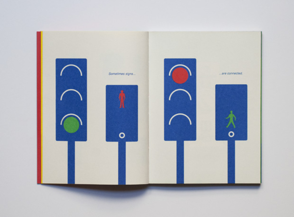
Book purposed to address a younger audience about symbols and signs, the simplistic design makes it an easy read and good for educational purposes, and its simplicity along with the offset pantone printed colours make it credible with an adult audience as well.
Adidas Laces 2011 - Buro Ubüro uebele visuelle kommunikation
 The wording "laces" is used to narrate the global networking involved in the company and also giving a sense movement to the design also highlighting the essence of sport. The type is fast and light almost bouncing off the walls reflecting the companies focus on audience, its neutral in colours offering an alternative space away from vivid colour.
 This lines within this wayfinding successfully presents a clear direction without using the conventional shapes, and instead utilises movement with the repetition of thin lines which works well in its context and is innovative in creating a modern look but also remains informative.

Primary research
Photos taken of the various wayfinding found around the Leeds city art gallery. As far as being informative there is obviously a clear direction and simplicity given within the design. Although this current asthetic does its desired job there some adjustments could be given to better represent the tone of the gallery, possibly including being more experimental and abstract away from , the previous research proves that there can be colour and imagery used to illustrate its point and also remains clear while also fitting with the brand.


(Above) Uses same colour for all and a darker shade to show the floor that someone is on.


No comments:
Post a Comment